Richard Wong 21 September, 2008
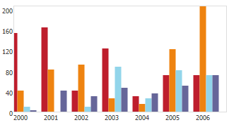
 Charts are important in visualising data to give a more profound understanding of the nature of given problem. A good charting solution for should render charts dynamically from raw data and allow multiple type of data presentation.
Traditionally we generate charts on the server-side but that means it will take up more bandwidth by the image all the way across the internet. Ideally we would just send the data to the browser and it will render the chart. With the advance in javascript and browser support, we have many powerful chart components out there based on Javascript. Now with the help of javascript frameworks, we can create charts in just a few lines of code.
Continue reading »
Richard Wong 8 September, 2008

Recently I revisited “” by John Maeda. He is a graphic designer, visual artist, and computer scientist at the MIT Media Lab. In the book, John proposes 10 laws for simplifying complex systems in business and life.
Although the book are mostly focused on product design, it could be applied to anything especially software development. It doesn’t matter whether you are coding or designing simplicity will always work and sale. Simpler code means less bug and less maintenance cost. Simpler interface means easier to learn and use.
Continue reading »
Richard Wong 28 August, 2008
Since I just updated the design of the site, I start thinking whether this new design is better. But realising there so many different aspect of site that we need to look at in order to measure the quality.
Then I found 50 Questions to Evaluate the Quality of Your Website by Carsten Cumbrowski from my starred item in google reader. It covers a wide range of areas including accessibility, design, navigation and more.
A sample of questions includes:
- Is content structurally separate from navigational elements?
- Are links labeled with anchor text that provides a clear indication of where they lead?
- Do clickable items stylistically indicate that they are clickable?
- How intuitive is it to navigate? Are signs obvious or obscured? Buttons/Links Like Text, that are not clickable and vice versa, links/buttons that cannot be identified as such
- Clear statement of PURPOSE of the site? Purpose must become clear within a few seconds without reading much or no text copy at all.
- Are the colors used harmonious and logically related?
- The fonts should be easily readable, and degrade gracefully.- Should look OK on various screen resolutions.
- Does the copywriting style suit the website’s purpose and ’speak’ to its target audience?
Although the list isn’t particularly targeting developers / designer, I think it is still a very useful list to reference if you are running your own site. If you can answer YES on most of the questions, you have done a great job. For me there are still a lot of work to do here…
Richard Wong 25 August, 2008
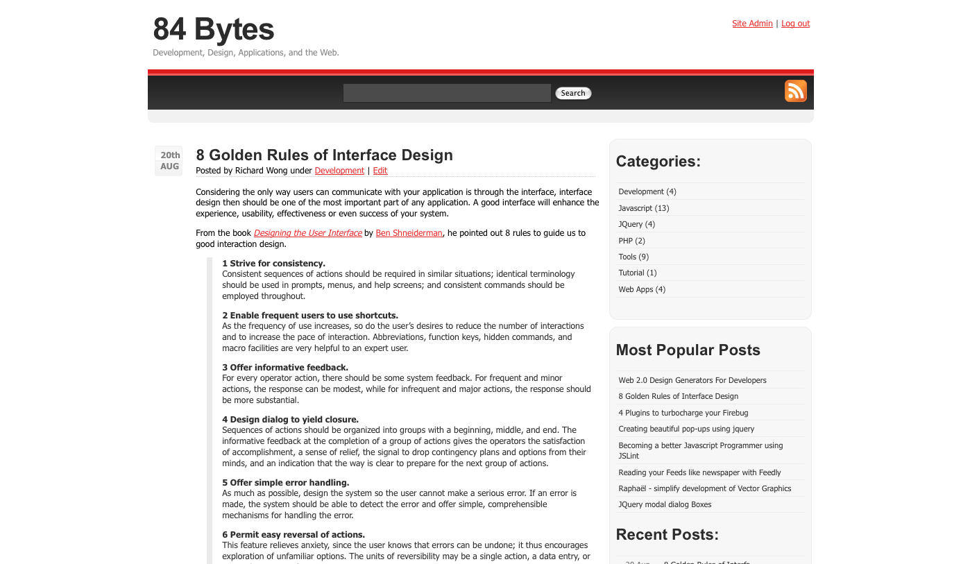
I have finally created my own theme for this blog. This is still a very early version which I will be busy updating for the coming weeks. The plan is to release often, release small :p
This is what the old design looks like

And it was based on .
I hope everyone will like this new design. Feel free to leave some feedback.
Richard Wong 20 August, 2008

Considering the only way users can communicate with your application is through the interface, interface design then should be one of the most important part of any application. A good interface will enhance the experience, usability, effectiveness or even success of your system.
From the book by Ben Shneiderman, he pointed out 8 rules to guide us to good interaction design.
Continue reading »
 Charts are important in visualising data to give a more profound understanding of the nature of given problem. A good charting solution for should render charts dynamically from raw data and allow multiple type of data presentation.

