New Look for 84 Bytes
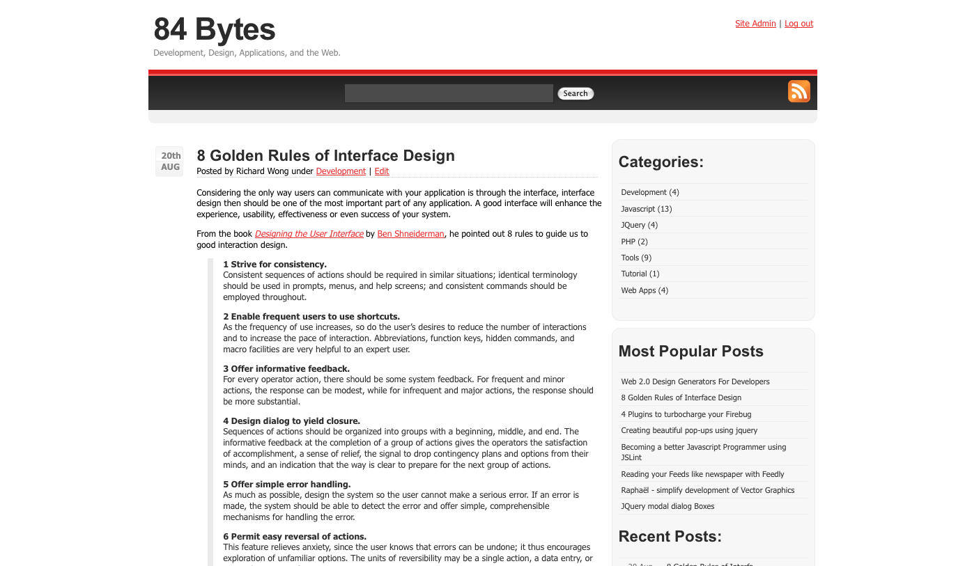
I have finally created my own theme for this blog. This is still a very early version which I will be busy updating for the coming weeks. The plan is to release often, release small :p
This is what the old design looks like
And it was based on .
I hope everyone will like this new design. Feel free to leave some feedback.

Comments so far
It looks great to me, Richard. I like what you’ve done with simple, high contrast colour scheme and the very minimalistic use of thick borders to separate areas. I’m looking forward to seeing your future revisions to this.
Post a comment